UA
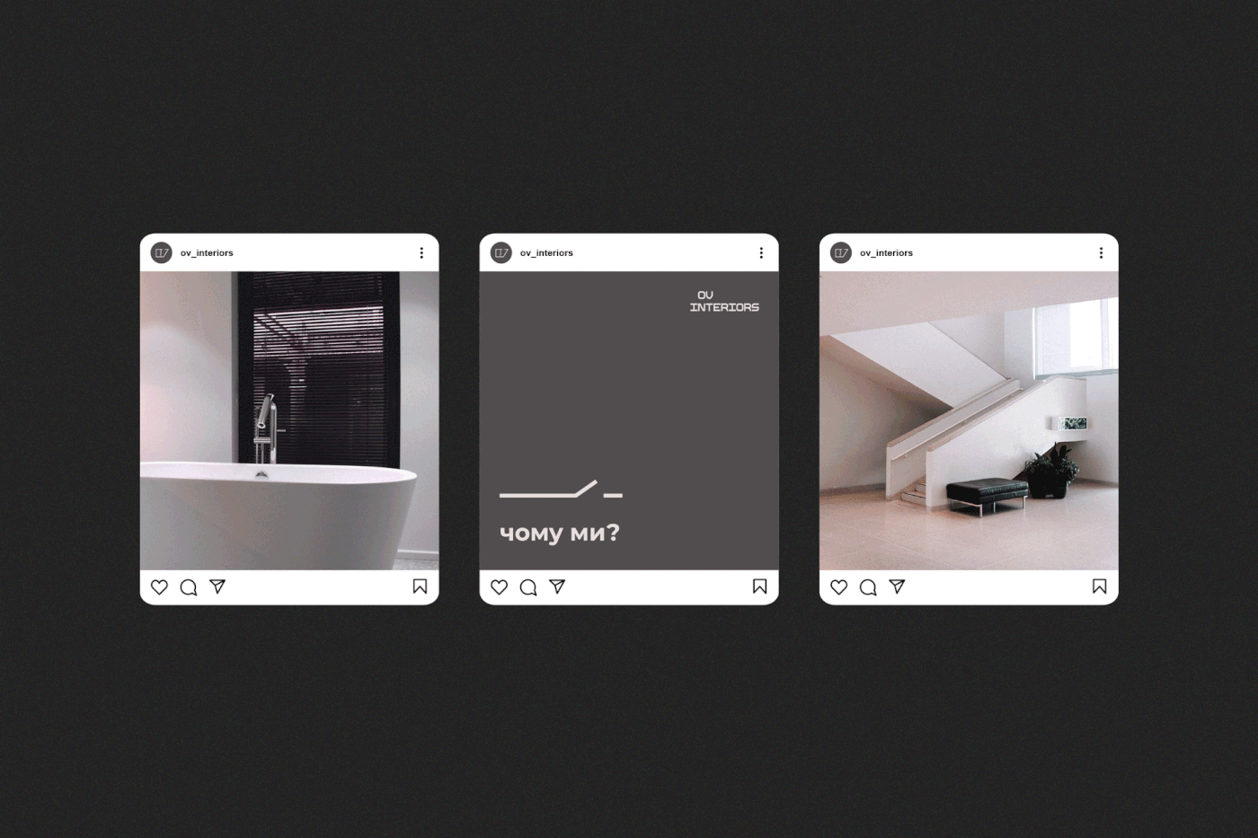
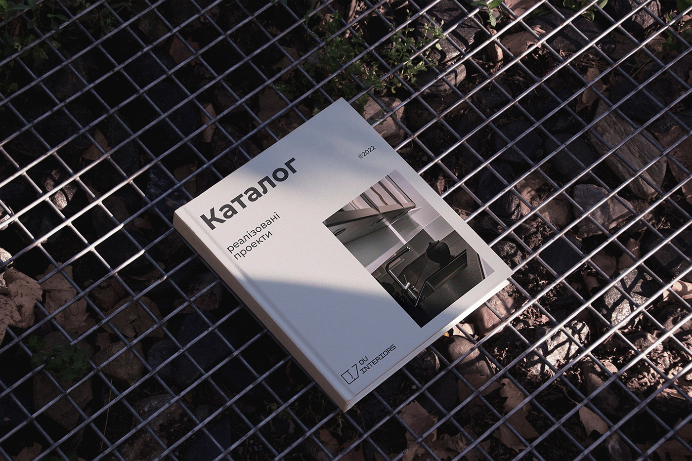
OV Interiors — студія дизайну інтер'єрів, що продає дизайн-проекти з плануванням, кресленнями та колажами, а також додатково робить 3D-візуалізацію.
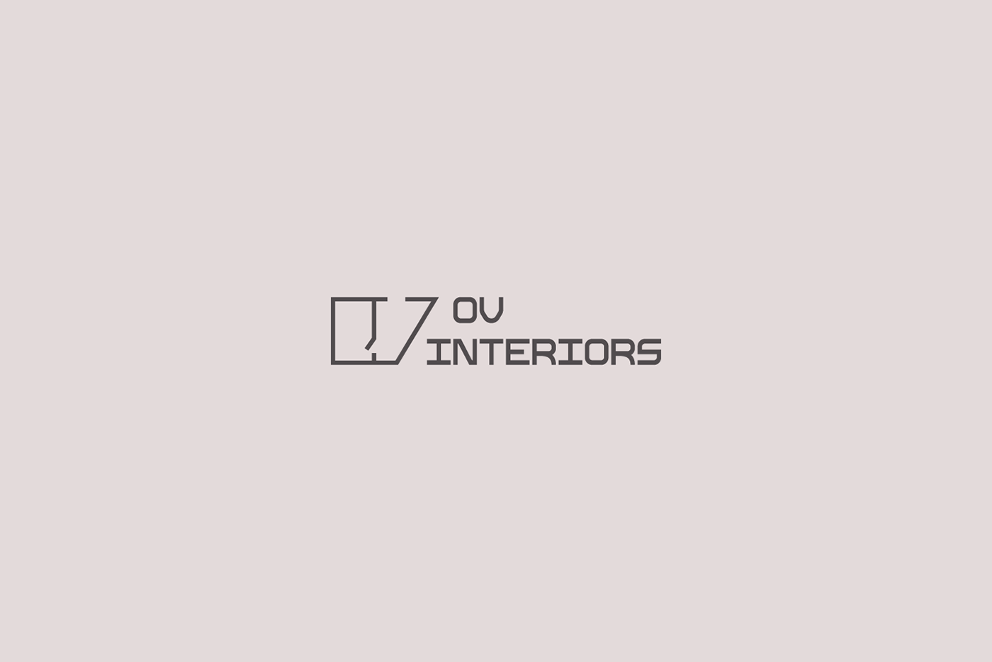
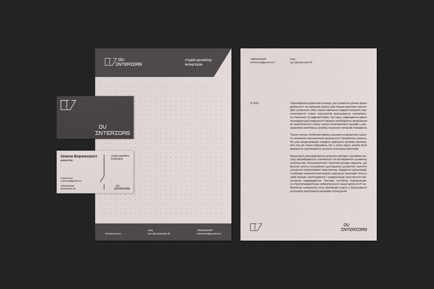
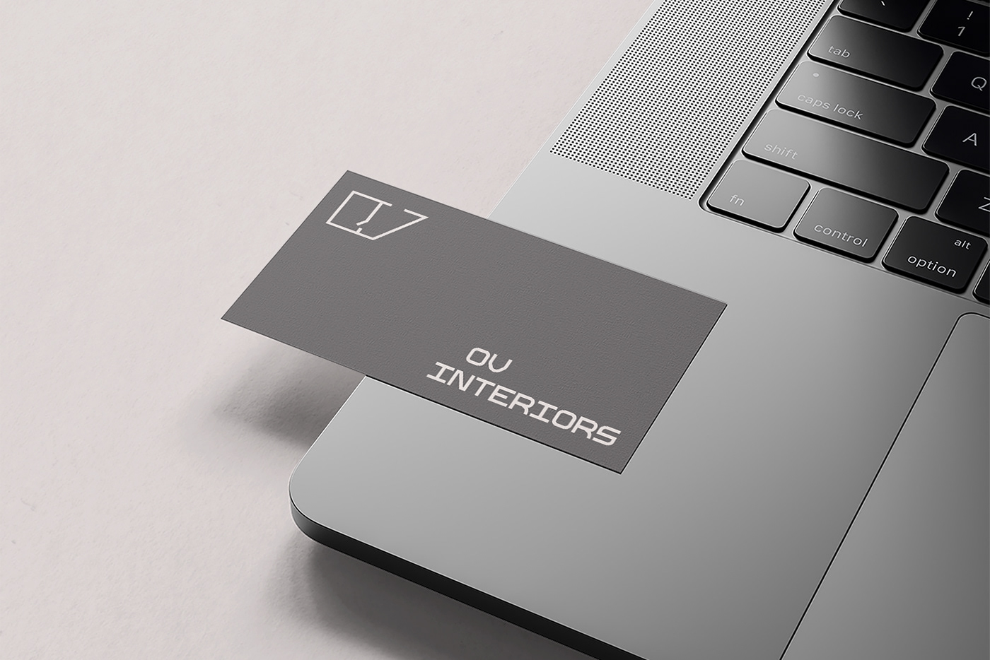
В рамках проекту було створено логотип та фірмовий стиль, в яких основним побажанням клієнта було відображення геометричності, світлоти, простоти та порядку, а також сучасності та зрозумілості. Необхідним було збереження ініціалів власника студії в знаці та шрифтовому написі логотипу.
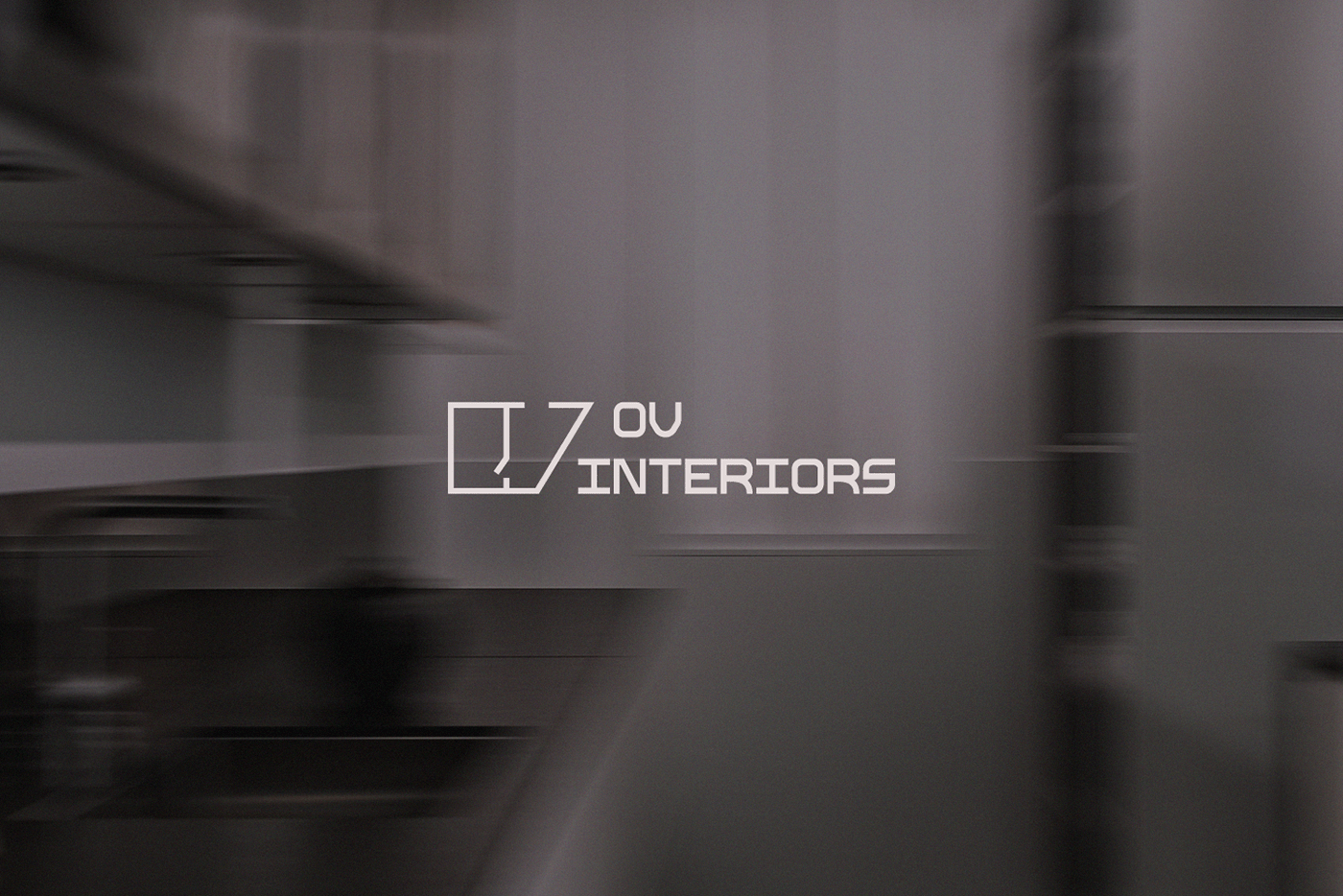
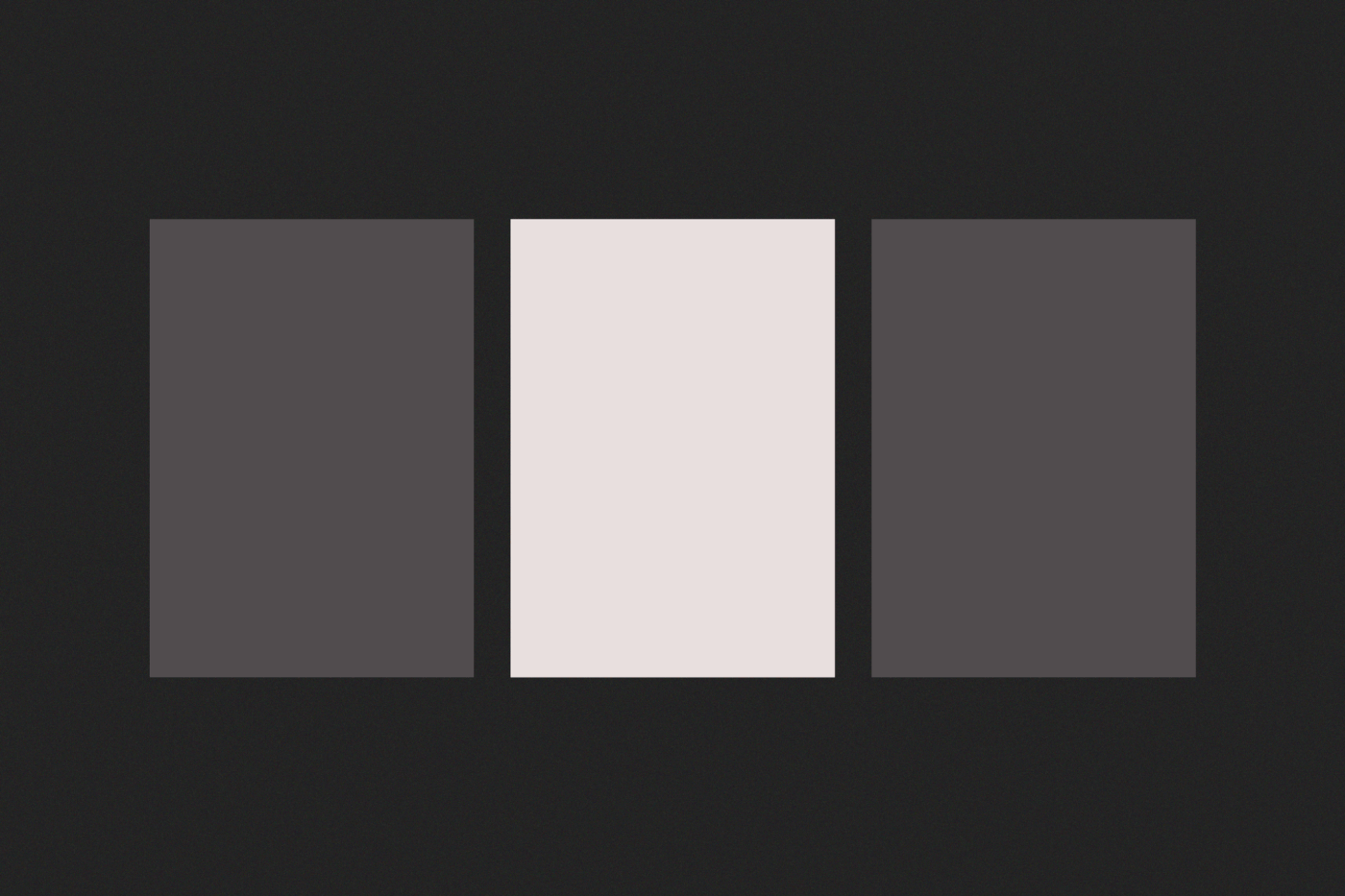
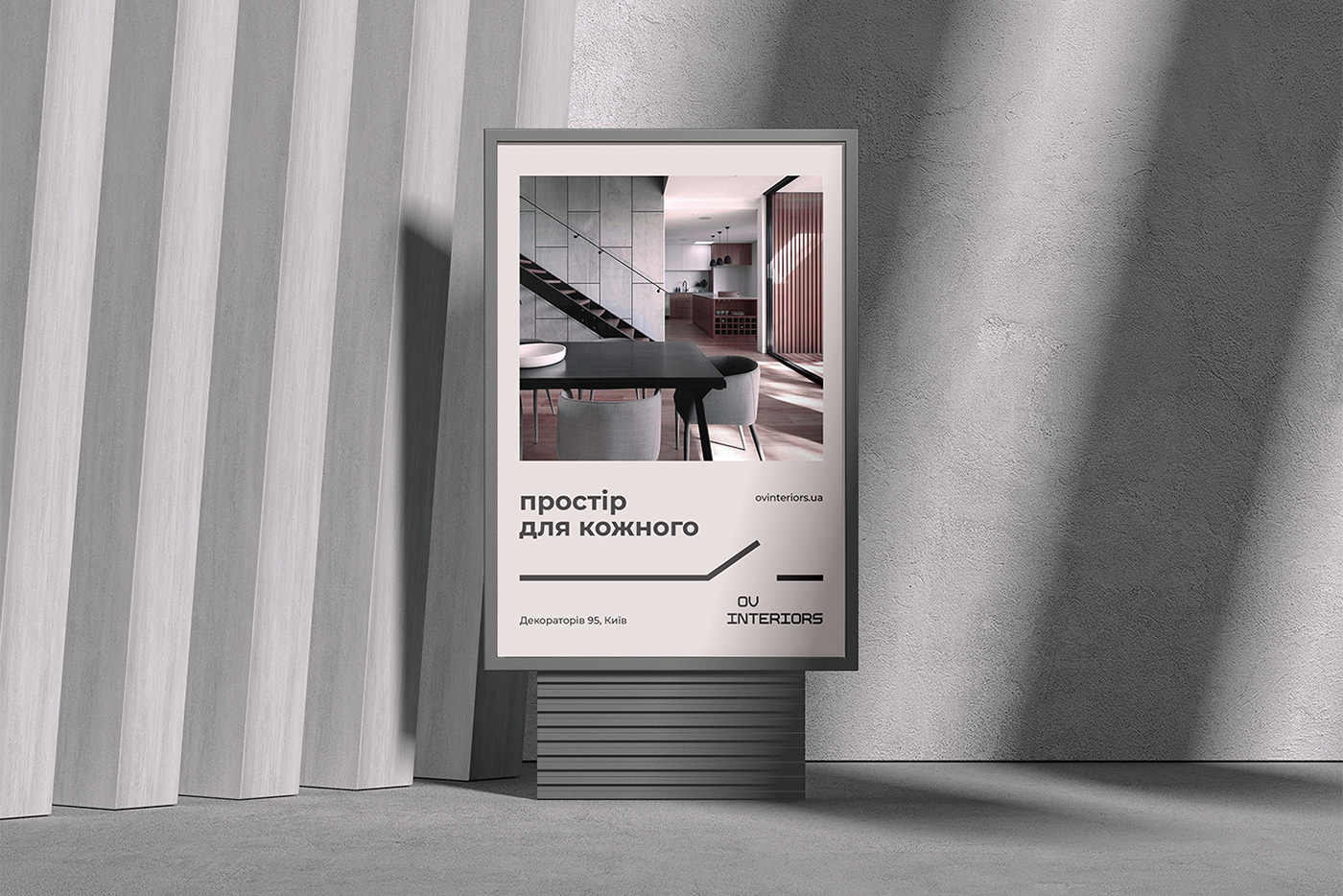
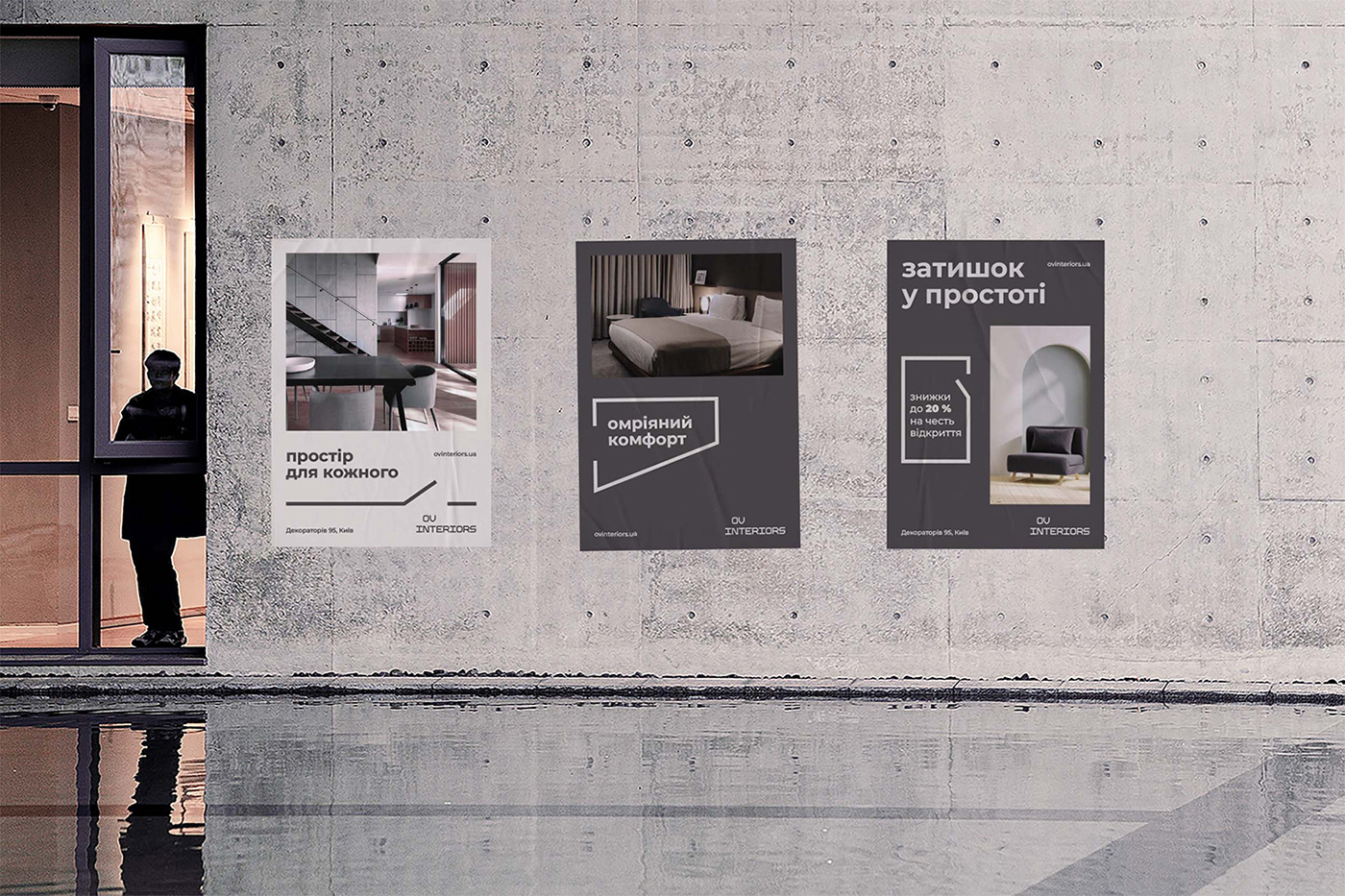
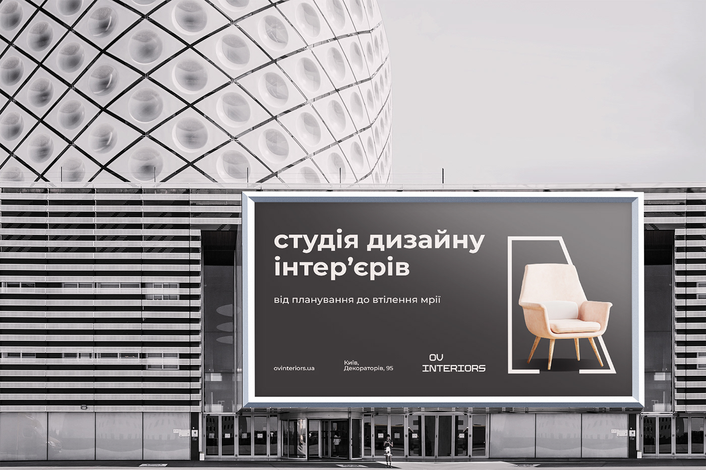
В концепцію логотипу закладено метафору креслення — невід’ємного етапу процесу розробки дизайну інтер’єру, що виникла з ряду асоціацій: інтер'єр → архітектура → проектування → креслення. В текстовому написі використано сучасний шрифт, що натхненний квадратними формами, який в процесі розробки логотипу було видозмінено шляхом заокруглення штрихів окремих літер задля надання елегантності суворим геометричним формам. В якості фірмового кольору обрано сірий тон з рожевим відтінком, який окрім спокою та стабільності несе в собі стриманість та делікатність. Метафора логотипу була продовжена у фірмовому стилі у вигляді геометричних елементів, що перегукуються з логотипом, і знайшли своє застосування у вигляді контейнерів для тексту та декоративних елементів. Верстка тексту на макетах здійснювалася з урахуванням сіток.
EN
OV Interiors is an interior design studio that sells design projects with planning, drawings and collages, as well as 3D visualization.
This project included the development of a logo and corporate style, in which the main desire of the client was to reflect geometricity, lightness, simplicity and order, as well as modernity and clarity. It was necessary to preserve the initials of the owner of the studio in the sign and font of the logo.
The concept of the logo incorporates the metaphor of drawing, an integral stage of the interior design development process, which emerged from a number of associations: interior → architecture → design → drawing. The text inscription uses a modern font inspired by square shapes, which was modified in the process of developing the logo by rounding the strokes of individual letters to give elegance to strict geometric shapes. A gray tone with a pink tint was chosen as the corporate color, which, in addition to calm and stability, carries restraint and delicacy. The metaphor of the logo was continued in the corporate style in the form of geometric elements that resonate with the logo and found their application in the form of containers for text and decorative elements. The layout of the text in the project was carried out taking into account grids.